Interactive Journeys Map
The Journeys Map provides a powerful visualization tool for analyzing transit system usage patterns and passenger movements.
Getting Started
Time Range Selection
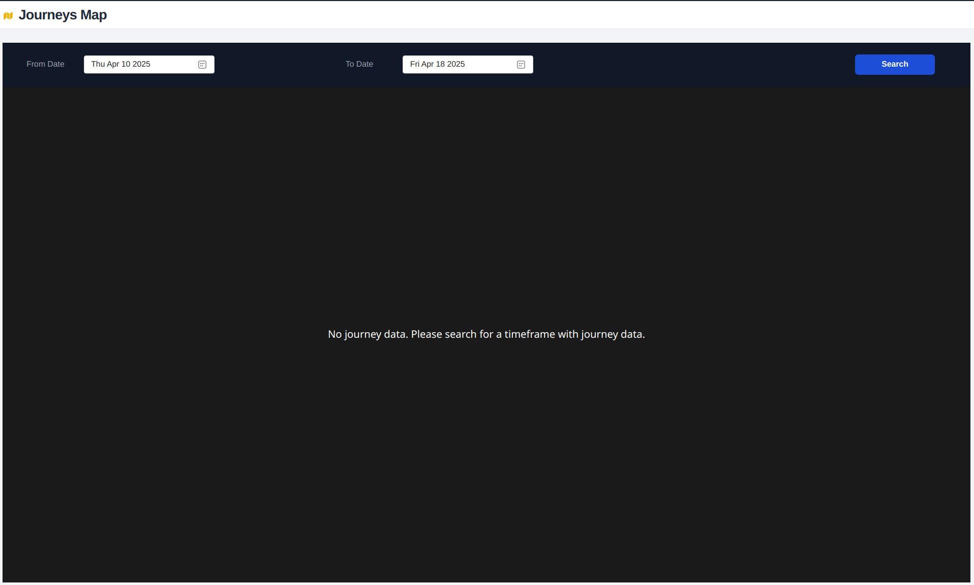
Begin by selecting the time range for your journey analysis. This defines the period for which journey data will be displayed and analyzed.
Map Interface Components
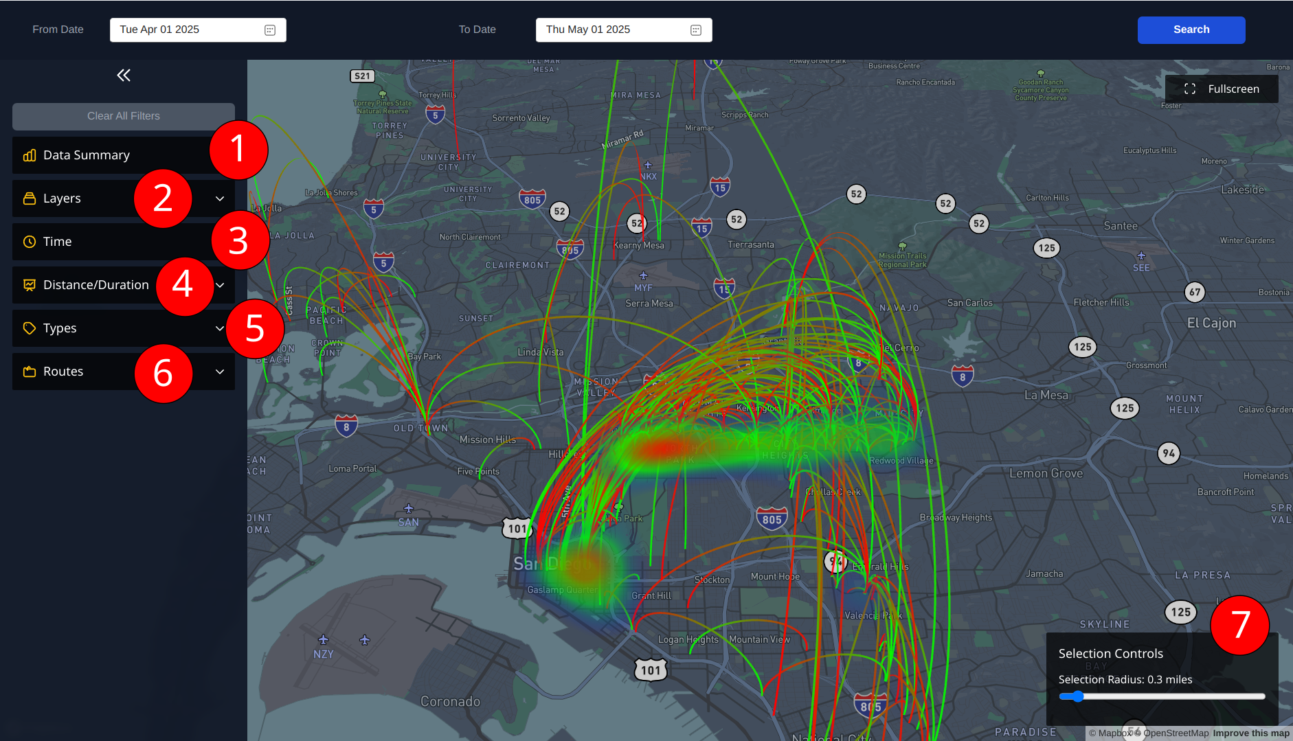
The interface consists of six main control sections that allow for detailed data visualization and filtering.
1. Data Summary
- Displays filtered journeys / total number of journeys
- Shows first record date/time
- Shows last record date/time
2. Layers Control
Toggle different visualization layers:
- Trip lines (direct lines: hover over line for trip information)
- Arc lines (curved journey paths with green as start and red as end)
- Source journey heatmap
- Destination journey heatmap
- Time Arc Colors to color code the start journey color to time of day
3. Time of Day Legend
- Color-coded time periods
- Hover functionality shows specific time ranges
- Enable/disable specific time periods
- Corresponds to
Time Arc Colorswhen enabled
4. Distance/Duration Filter
Filter journeys by distance or duration min/max type:
- Distance slider: Set minimum and maximum journey distance
- Duration slider: Set minimum and maximum journey duration in minutes
- Use both filters together to analyze specific journey segments
5. Types Filter
Filter journeys by feature type:
- Cyclist usage
- Mobility/priority seating usage
- Combine types for comprehensive analysis
6. Routes Filter
- Select specific route IDs
- Multiple route selection available
- Analyze route-specific patterns
7. Selection Control
- Click-based filtering on map
- Select specific areas or points
- Adjust radius of selection and filter start/end journeys
- Clear selection option available
Selection Control
The Selection Control panel activates when you click anywhere on the map, providing powerful filtering capabilities for journey analysis.
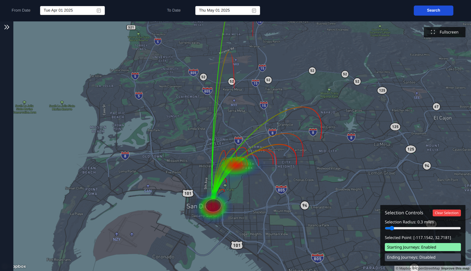
Radius Control
- Adjust the size of the selection area
- Larger radius captures more journeys
- Smaller radius for precise location analysis
- Dynamic updating as radius changes
Journey Type Filters
- Starting Journeys: Toggle to show journeys that begin in the selected area
- Ending Journeys: Toggle to show journeys that end in the selected area
- Enable both for complete flow analysis
Analysis Techniques
Combined Visualization
- With Heatmaps
- Enable source heatmap to see where cyclists/mobility users travel to
- Enable destination heatmap to see where cyclists/mobility users come from
- Identify popular origin/destination pairs
- With Time Arc Colors
- Enable
Time Arc Colorsto visualize time of day behavior for all journeys filtered
- Enable
- With Trip Lines
- Enable
Trip Linesin Layers Control to view the different routes for filtered journeys
- Enable
- With Distance/Duration
- Adjust min or max
Distance/Durationto filter out short or long journeys
- Adjust min or max
Common Use Cases
-
Origin Analysis
- Select a location
- Enable starting journeys
- View destination heatmap
- Understand where journeys are destined
-
Destination Analysis
- Select a location
- Enable ending journeys
- View source heatmap
- Understand where journeys are sourced
Easily use Clear All Filters to reset view to show all availble journeys from the query